Understanding CMYK Printing
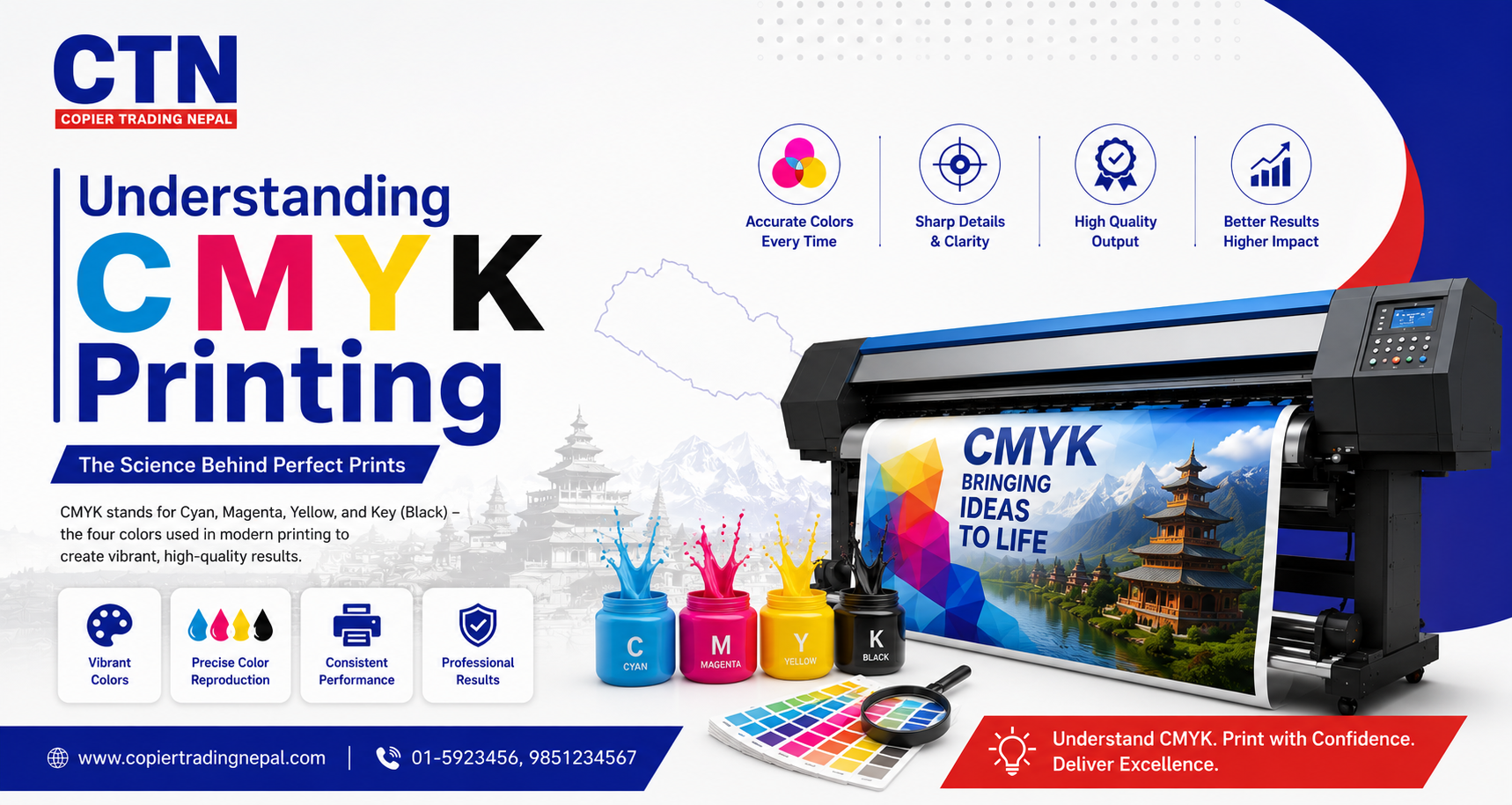
Look closely at any printed banner, flyer or business card with a magnifying glass and you'll see it isn't made of millions of colors — it's made of tiny dots of just four inks. That system is called CMYK, and understanding how it works is the difference between a print job that matches your design and one that comes back looking dull, shifted, or nothing like what you saw on screen.
What Is CMYK Printing?
CMYK is a subtractive color model used by almost every printer — from a desktop inkjet to a large-format flex printer — to reproduce color using four inks: Cyan, Magenta, Yellow, and Key (black). Instead of adding light like a screen does, printing works by layering inks on white paper or media, with each ink absorbing (subtracting) certain wavelengths of light while reflecting others back to your eye.
C — Cyan
Absorbs red lightM — Magenta
Absorbs green lightY — Yellow
Absorbs blue lightK — Key (Black)
Adds depth & contrastThe "K" stands for Key rather than black, referring to the key plate that historically aligned the other three colors in traditional press printing.
How CMYK Differs from RGB
Every screen — your phone, monitor or TV — displays color using RGB (Red, Green, Blue), an additive model where combining all three colors of light at full intensity produces white. Printing works the opposite way: combining all four CMYK inks produces something close to black, not white, because ink absorbs light rather than emitting it.
RGB — Screens
Additive light model. Wider color range, especially in bright blues, greens and neon shades that ink physically cannot reproduce.
CMYK — Print
Subtractive ink model. Smaller, more muted range of achievable colors, which is why vivid screen colors often look duller once printed.
How the Four Colors Combine
Every color you see in a printed image is built from tiny overlapping dots of cyan, magenta, yellow and black ink, printed at different percentages. Viewed up close through a loupe, a "brown" might actually be a mix of magenta, yellow and a touch of black dots — your eye blends them into a single color from a normal viewing distance.
- Cyan + Magenta produces blue tones
- Magenta + Yellow produces red tones
- Cyan + Yellow produces green tones
- All three plus black (rich black) produces deep, dense black for text and shadows
A file that "looks perfect" on your screen but was never converted to CMYK is the single most common reason a print job doesn't match the customer's expectations.
— Common feedback loop between designers and print shopsPreparing Files for CMYK Printing
Getting predictable, accurate color starts before the file ever reaches the printer. A few habits at the design stage prevent most color surprises.
- Set your document color mode to CMYK from the start, rather than converting at the last step
- Avoid pure RGB blacks (0,0,0) for large fill areas — use a rich black mix instead for deeper, more even coverage
- Keep total ink coverage within the printer's recommended limit to avoid oversaturated, slow-drying prints
- Preview a soft-proof or request a physical test print for jobs where exact color matching matters
- Flag any brand colors with exact CMYK values rather than relying on how they look on your screen
Color Calibration & Media
Even a correctly prepared CMYK file can print differently depending on the machine, ink batch, and material it's printed on. This is normal and expected in real-world print production.
- Different media — flex, vinyl, paper, canvas — absorb ink differently, shifting the final color slightly
- Printers should be profiled and calibrated periodically so color output stays consistent over time
- Ink batches can vary slightly between suppliers, which is why long-running jobs should use ink from the same batch where possible
- Lighting conditions when reviewing a proof affect how accurate the color appears to the eye
Troubleshooting Common Color Issues
| What you see | Likely cause |
|---|---|
| Overall dull or washed-out colors | File was never converted from RGB, or ink levels are low |
| Color cast (everything looks slightly pink or green) | Printer needs calibration or a nozzle is under-printing one ink |
| Text or fine lines look blurry or muddy | Rich black overused on small text instead of pure K black |
| Colors shift between two prints of the same file | Different media batch, ink batch, or missed calibration cycle |
Frequently Asked Questions
CMYK stands for Cyan, Magenta, Yellow and Key (black) — the four ink colors combined in varying amounts to reproduce the full range of colors in a printed image.
Screens display color using light through RGB (red, green, blue), which has a wider and brighter range than CMYK ink on paper or flex, so bright screen colors — especially blues, greens and neons — often appear duller once printed.
For anything going to print, design or convert the file to CMYK before sending it to the printer, since this lets you preview and correct color shifts before the job is printed rather than after.
Rich black uses all four inks and can cause fine text to look soft or misregistered if the layers aren't perfectly aligned, so pure K black is usually sharper and more reliable for small text.